Modern, responsive IT Solutions HTML Website Template with Bootstrap design for technology companies and startups.
Introduction to Kaneltec – The Perfect IT Solutions HTML Template
In today’s digital-driven business world, having a strong, professional online presence is not optional—it is essential. For technology agencies, startups, or IT service providers, the Kaneltec IT Solutions HTML Website Template delivers a sleek, fully responsive, and visually captivating design that blends innovation with practicality. Built using HTML5, CSS3, Bootstrap 5, and modern libraries like Animate.css and Owl Carousel, this template is optimized to help IT firms showcase their services, projects, and team members with clarity and style.
This blog explores every element of the Kaneltec HTML template—from its top-tier design architecture to its functional features and SEO benefits—offering a complete overview of how it empowers businesses to create a commanding digital identity.
Why Choose the Kaneltec IT Solutions HTML Template
The Kaneltec template stands out because it provides a complete, ready-to-use front-end structure ideal for IT companies, web development agencies, digital marketing firms, and consulting businesses. Unlike CMS platforms that rely on heavy frameworks, this HTML template ensures faster loading times, cleaner code, and greater customization freedom.
Key reasons to choose Kaneltec include:
- Fully responsive, mobile-friendly design that adapts to all devices
- SEO-ready HTML structure for better search engine rankings
- Lightweight performance optimized for speed and usability
- Modular layout for flexible customization
- Integration with Bootstrap 5 components for easy scalability
These features make it not just a design layout, but a business asset ready for deployment across multiple service-oriented niches.
Structure Overview of the IT Solutions Template
1. Topbar and Navigation
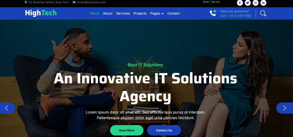
The topbar features essential contact details such as the company address, email, and social media icons for Facebook, Twitter, Instagram, and LinkedIn. It also includes a note section highlighting the company’s business growth promise—”We help you to grow your business”—reinforcing credibility and professionalism.
The navigation bar is built using Bootstrap’s responsive navbar components, ensuring seamless functionality on all devices. The navigation menu includes links to major pages: Home, About, Services, Projects, Blog, Team, Testimonials, and Contact. Additionally, a dropdown menu under “Pages” enhances accessibility to secondary content.
A prominent call section features a phone icon with animation effects and a contact number, encouraging immediate customer engagement.
2. Hero Carousel – Making a Strong First Impression
The homepage carousel is powered by Bootstrap’s carousel component, featuring two visually striking slides. Each slide includes high-resolution imagery, bold headlines like “An Innovative IT Solutions Agency”, and actionable buttons such as Read More and Contact Us.
This section captures visitors’ attention instantly while delivering the company’s core message. The inclusion of animated captions ensures dynamic transitions and keeps the design engaging without overwhelming the user.
3. Facts Counter – Showcasing Achievements
The Facts Section uses animated counters to highlight impressive statistics like:
- 99% success rate in customer satisfaction
- 25+ thousand successful businesses
- 120 total clients served
- 5-star client reviews
This section uses a secondary background color and bold typography to reinforce trust and demonstrate credibility. The combination of animation and numbers communicates reliability while maintaining visual appeal.
4. About Section – Telling the Brand Story
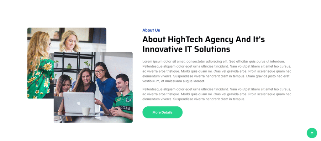
The About Us section combines strong visual design with storytelling. It uses dual-layered imagery—two overlapping rounded photos—to create an aesthetic contrast. On the right, the text introduces the HighTech Agency and its mission to deliver innovative IT solutions.
Key highlights include:
- Modern visual storytelling with overlapping image effects
- Clear explanation of company values and approach
- Responsive design alignment for desktop and mobile users
- Call-to-action button encouraging users to explore more details
The balance between visuals and written content ensures the section remains informative while maintaining design harmony.
5. Services Section – Highlighting Expertise
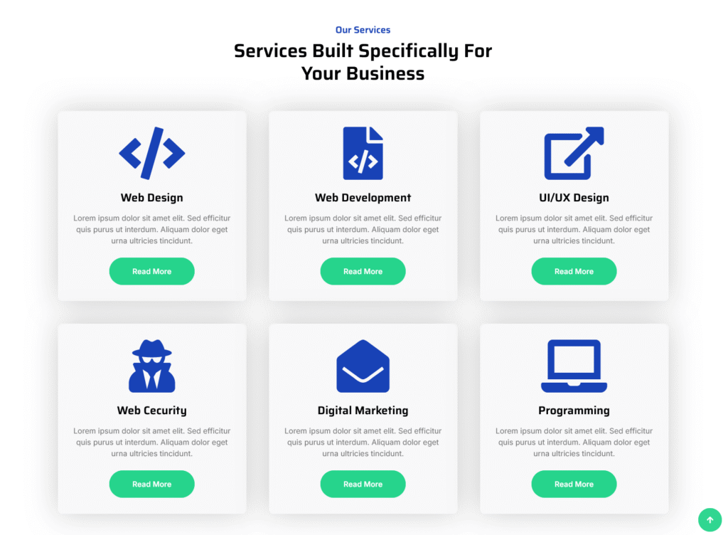
The Services section is one of the most feature-rich components of the template. It includes six distinct service cards, each represented with an icon, heading, short description, and “Read More” button.
Services featured:
- Web Design
- Web Development
- UI/UX Design
- Web Security
- Digital Marketing
- Programming
Each card uses Font Awesome icons and color-coded elements that make scanning easier. The grid layout ensures adaptability to different screen sizes, and animation effects are powered by WOW.js for fade-in transitions as users scroll.
6. Projects Section – Demonstrating Professional Work
The Projects Section presents real-world examples of completed work through an elegant grid display. Each project card includes an image, overlay effect, project title, and category label. Examples include:
- Web Design – Web Analysis
- Cyber Security – Security Core
- Mobile Info – Upcoming Phone
- Digital Marketing – Marketing Analysis
The hover effect and content overlay make interactions visually appealing, while image rounding adds a modern touch. Businesses can use this section to showcase their portfolio, helping clients visualize the range and quality of services offered.
7. Blog Section – Sharing Insights and Expertise
The Blog Section provides a professional structure for publishing news, insights, and updates. Each blog card includes:
- Feature image
- Category tag (e.g., Web Design, Development, Mobile App)
- Author image and name
- Publication date
- Blog summary
- Social media sharing icons
- Comments and share count
By integrating this blog layout, companies can enhance SEO performance through regular content publishing. The inclusion of sharing buttons ensures better engagement and traffic distribution across platforms.
8. Team Section – Introducing the Professionals
The Team Section introduces company members with circular profile photos, names, designations, and social media links. Subtle hover animations and consistent color themes align with the brand’s modern aesthetic. This section personalizes the company by putting real faces behind the brand name, increasing credibility and human connection.
9. Additional Pages and Error Handling
The template also includes dedicated pages such as:
- Our Blog
- Our Team
- Testimonials
- 404 Error Page
These prebuilt pages provide a cohesive user experience, ensuring every aspect of the website maintains brand consistency. The 404 error page, for instance, is thoughtfully designed to guide users back to the homepage rather than ending their journey abruptly.
Design Features That Set Kaneltec Apart
Responsive and Mobile-Optimized Layout
The Kaneltec template is built on Bootstrap 5, ensuring complete responsiveness. Every element—from navigation to image grids—scales gracefully on all devices, including tablets and smartphones.
Modern UI Elements and Typography
Kaneltec integrates Google Fonts (Inter and Saira) to ensure professional typography. These fonts complement the modern look of the template while maintaining readability. Font Awesome and Bootstrap Icons enrich the user interface with clear visual cues.
Animation and Interaction Effects
The inclusion of Animate.css and WOW.js libraries introduces smooth entrance animations that activate upon scrolling. Subtle effects like fading, sliding, and zooming add sophistication to the user experience without affecting performance.
Lightweight and SEO-Friendly Code
Clean HTML and semantic tags ensure high SEO compatibility. The structure prioritizes accessibility, proper heading hierarchy (H1 to H6), and metadata integration for better search ranking. Additionally, the template’s minimal script dependencies reduce loading times and enhance page performance.
Integration Ready
The modular codebase allows easy integration with backend frameworks or CMS systems like WordPress, Laravel, or React. Developers can convert static sections into dynamic components quickly, making it future-proof for scaling businesses.
Technical Breakdown of the Template
| Feature | Description |
|---|---|
| Framework | Bootstrap 5 |
| Languages Used | HTML5, CSS3, JavaScript |
| Libraries | Animate.css, WOW.js, Owl Carousel |
| Icons | Font Awesome, Bootstrap Icons |
| Font Family | Inter & Saira (Google Fonts) |
| Compatibility | Chrome, Firefox, Safari, Edge |
| File Structure | Organized directories for CSS, JS, images, and libraries |
This clean organization simplifies editing, ensuring developers can modify and extend the code efficiently.
SEO Benefits of Using the Kaneltec Template
Search engines value structured, mobile-optimized websites. The Kaneltec template aligns perfectly with SEO best practices through:
- Semantic HTML elements (header, nav, section, footer)
- Optimized metadata and alt attributes for images
- Responsive design ensuring better mobile ranking
- Fast loading speed, reducing bounce rate
- Clean URL-ready structure for page linking
By combining performance with aesthetics, this template maximizes the potential for search visibility and lead conversion.
Customization Opportunities
Kaneltec offers flexibility for businesses to personalize their digital presence. Developers can easily:
- Change color palettes via CSS variables
- Replace demo content and imagery
- Modify grid layouts for portfolio or service sections
- Add dynamic scripts for forms or animations
- Integrate contact forms using third-party APIs
The template’s scalability ensures it can evolve alongside business growth, from small agency websites to complex enterprise solutions.
Advantages of HTML Templates for IT Companies
While CMS platforms offer convenience, HTML templates like Kaneltec bring performance and control. The advantages include:
- Speed: No database calls or heavy plugins slow down the website.
- Security: Reduced vulnerability to common attacks such as SQL injection.
- Customization: Developers have full control over structure and styling.
- Maintenance: Static files require less monitoring and are easier to host.
- Portability: Easily uploaded to any server or integrated with any backend.
For IT solution providers who value precision and speed, HTML templates are a strategic choice.
Use Cases for the Kaneltec IT Solutions Template
Kaneltec’s flexibility makes it suitable for multiple business types:
- IT service companies
- Web and app development firms
- Cybersecurity consultants
- Digital marketing agencies
- Tech startups
- Software solution providers
- Business consulting services
Its clean design and modular architecture make it adaptable for any digital-focused enterprise.
Final Thoughts – Kaneltec as a Complete Web Solution
The Kaneltec IT Solutions HTML Website Template is not just a static design—it’s a complete digital framework built for modern technology businesses. It combines design excellence, performance optimization, and developer-friendly architecture to help companies stand out in a competitive marketplace.
Whether you’re launching a new IT startup, redesigning an agency website, or developing a digital platform for client services, Kaneltec provides the ideal foundation. It’s lightweight, visually captivating, and easy to customize—offering the perfect blend of aesthetics and efficiency.
In summary: Kaneltec empowers your IT business with a powerful online presence that looks professional, performs flawlessly, and delivers lasting impact.

Download IT Solutions HTML Website Template Source Code
