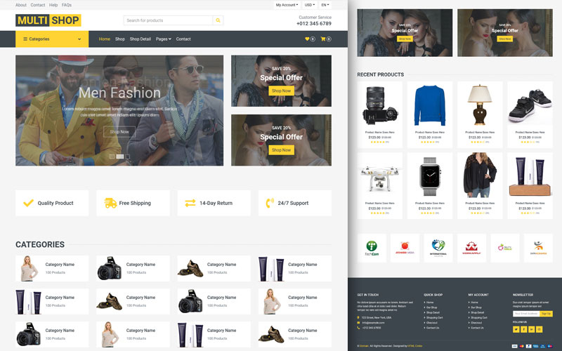
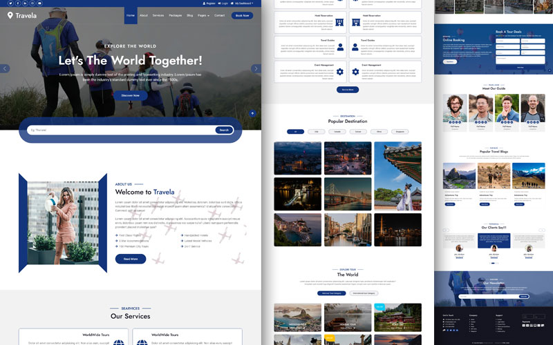
Professional electrical shop website HTML template featuring responsive design and comprehensive e-commerce functionality.
The digital marketplace has transformed how electronics retailers connect with customers. A well-designed website template serves as the foundation for establishing a professional online presence that drives sales and builds customer trust. Modern electrical shop templates combine aesthetic appeal with functional design elements that cater specifically to the needs of electronics and technology retailers.
The template architecture represents a comprehensive solution for businesses ranging from small electronics boutiques to large-scale technology retailers. By leveraging pre-built components and responsive design principles, store owners can launch professional e-commerce platforms without extensive development resources or technical expertise.
Essential Features of the Electro Template Framework
Navigation and Header Components
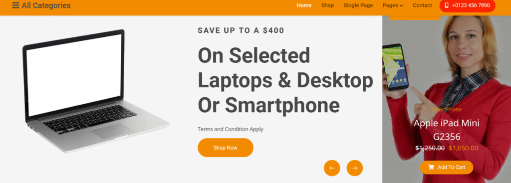
The template’s navigation system employs a multi-tiered approach that balances accessibility with functionality. The topbar section provides quick access to customer service links, language preferences, and currency selection options, ensuring international customers can seamlessly browse products. The main navigation bar features a collapsible category menu that organizes products into logical groupings including accessories, electronics and computers, laptops and desktops, mobiles and tablets, and smartphone and smart TV categories.
The search functionality incorporates a sophisticated input system with category filtering, allowing customers to narrow their searches within specific product groups. This targeted approach reduces the time customers spend finding desired items and improves overall user experience. The header also integrates essential e-commerce elements including comparison tools, wishlist functionality, and shopping cart visibility with real-time price updates.
Hero Carousel and Promotional Displays
The carousel section serves as the primary attention-grabbing element on the homepage, featuring dynamic slides that showcase current promotions and featured products. Each carousel item includes high-quality product imagery paired with compelling call-to-action messaging that emphasizes savings opportunities. The template utilizes specific promotional language highlighting discount amounts, creating urgency through phrases like “Save Up To A $400” on selected products.
Adjacent to the main carousel, a banner section presents special offer opportunities with prominent visual treatment. This dual-display approach ensures maximum visibility for promotional campaigns while maintaining clean design aesthetics. The banner incorporates product details including original and discounted pricing, creating transparent value propositions that encourage immediate purchasing decisions.
Service Guarantee Section
The template includes a dedicated services section that communicates six core value propositions to potential customers. These guarantees address common purchasing concerns in the electronics retail space. The free return policy emphasizes a thirty-day money-back guarantee, reducing purchase anxiety for high-value items. Free shipping commitments remove additional cost barriers that might prevent conversion.
Twenty-four-seven support availability demonstrates commitment to customer satisfaction beyond the initial sale. The gift card incentive encourages larger purchase amounts by offering rewards for orders exceeding fifty dollars. Secure payment messaging addresses digital security concerns that remain prevalent in online shopping. Finally, the online service guarantee reinforces the return policy, creating multiple touchpoints for trust-building throughout the user journey.
Product Display and Organization Systems
Tabbed Product Navigation
The template implements a sophisticated tabbed navigation system that organizes products into four distinct categories: All Products, New Arrivals, Featured, and Top Selling. This organization strategy serves multiple purposes in the customer journey. The All Products view provides comprehensive browsing for exploratory shoppers, while New Arrivals targets trend-conscious customers seeking the latest technology releases.
Featured products highlight items with specific promotional value or high-profit margins, allowing store owners to strategically direct customer attention. The Top Selling category leverages social proof by showcasing popular items, reducing decision paralysis through implicit peer recommendations. Each tab maintains consistent visual treatment while displaying unique product assortments tailored to different shopping motivations.
Product Card Structure and Information Hierarchy
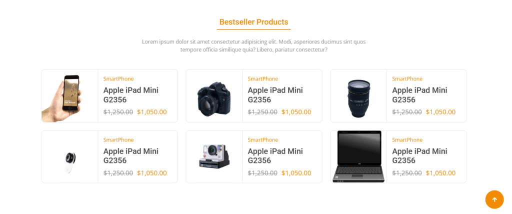
Individual product cards employ a standardized format that balances visual appeal with informational clarity. Each card begins with high-quality product imagery that serves as the primary attention element. Badge overlays designate special status including “New” and “Sale” indicators that quickly communicate product attributes without requiring detailed reading.
The information section includes category labels, specific product names, and dual pricing displays showing both original and discounted prices. This pricing transparency establishes credibility while emphasizing value propositions. Star rating systems provide quick quality assessments based on customer feedback, though the template uses placeholder ratings that should be replaced with actual review data in production environments.
Interactive Product Elements

Hover states reveal additional functionality including quick-view options that allow customers to preview product details without leaving the current page. The add-to-cart button receives prominent placement with clear icon support, reducing friction in the purchasing process. Secondary actions including comparison and wishlist features appear in a grouped format, maintaining clean visual hierarchies while providing advanced functionality for engaged shoppers.
Promotional Banner Integration
Large Format Product Showcases
The template incorporates multiple large-format promotional banners that break up product grids and maintain visual interest throughout long scrolling pages. These banners employ full-width layouts with high-impact imagery paired with overlay text that communicates specific product benefits and pricing information. The semi-transparent overlay technique ensures text readability while maintaining photographic integrity.
Banner calls-to-action use button elements with consistent styling that matches the overall design system, creating cohesive user experiences as customers navigate between sections. The strategic placement of these banners between product sections creates natural breaking points that prevent overwhelming customers with continuous product grids.
Dual Banner Promotional Strategy
A two-column banner section presents contrasting promotional approaches within a unified design framework. One banner focuses on specific product offerings with detailed pricing information and product specifications, targeting customers in active research phases. The adjacent banner employs percentage-based discount messaging with broader appeal, capturing attention from bargain-seeking shoppers who respond to overall savings rather than specific product features.
This dual approach maximizes promotional effectiveness by addressing different customer motivations within a single screen section. The contrasting color treatments further differentiate the messaging while maintaining overall design cohesion through consistent typography and button styling.
Technical Architecture and Responsive Design
Framework and Library Integration
The template foundation utilizes Bootstrap, a widely adopted CSS framework that provides responsive grid systems and pre-built components. This choice ensures cross-device compatibility without requiring extensive custom media queries. The Bootstrap integration includes the complete stylesheet along with necessary JavaScript components for interactive elements including dropdowns, carousels, and collapsible navigation menus.
Font Awesome provides icon support throughout the template, offering scalable vector icons that maintain clarity across all screen resolutions. The icon library includes shopping-related symbols, social media icons, and user interface elements that communicate functionality without requiring text labels. Google Fonts integration through the Open Sans and Roboto typefaces ensures consistent typography across different operating systems and browsers.
Animation and Interaction Libraries
The WOW animation library paired with Animate CSS creates engaging entrance animations as users scroll through the page. These animations add polish and professionalism to the browsing experience without overwhelming users with excessive motion. The Owl Carousel library powers the hero carousel section, providing smooth transitions and touch-friendly navigation for mobile users.
These libraries operate through content delivery networks, reducing hosting requirements and leveraging browser caching for improved performance. The modular nature of these dependencies allows developers to selectively include or exclude features based on specific project requirements.
Customization Opportunities and Extension Points
Visual Theming and Brand Alignment
The template’s color scheme centers on primary blue and secondary orange accent colors that create energetic yet trustworthy visual associations. Store owners can modify these color values through centralized CSS variables or direct stylesheet editing to align with existing brand guidelines. Typography choices can similarly be adjusted through font family declarations, though the current selections provide excellent readability across device types.
Image placeholders throughout the template should be replaced with actual product photography that represents inventory accurately. High-quality product images significantly impact conversion rates in e-commerce environments, making professional photography a worthwhile investment for retailers implementing this template.
Functional Enhancements and Backend Integration
While the template provides comprehensive frontend design, production implementations require backend integration for core e-commerce functionality. Shopping cart operations need server-side processing to manage inventory, calculate totals including taxes and shipping, and process payment transactions securely. User account systems require database integration for storing customer information, order history, and saved preferences.
Product data management systems should replace static HTML content with dynamic database-driven displays that allow easy inventory updates without manual code editing. Search functionality requires server-side processing or integration with search platforms like Elasticsearch for robust filtering and relevancy ranking. Review systems need database support for storing and displaying customer feedback with appropriate moderation workflows.
Mobile Optimization and Touch Interface Design
Responsive Breakpoint Strategy
The template implements Bootstrap’s mobile-first responsive design philosophy, establishing base styles for mobile devices and progressively enhancing layouts for larger screens. The navigation system transforms into a hamburger menu on mobile devices, conserving screen space while maintaining full feature access. Product grids automatically reflow from four columns on desktop displays to single columns on mobile phones, ensuring comfortable browsing regardless of device.
The search interface remains accessible on mobile devices through dedicated screen space rather than relying on expandable elements that might be overlooked. Shopping cart information maintains visibility through persistent header placement, allowing customers to track purchase totals without scrolling.
Touch-Friendly Interaction Design
Button sizes throughout the template meet or exceed minimum touch target recommendations, reducing accidental activations on touchscreen devices. Spacing between interactive elements provides adequate separation to prevent frustration from unintended clicks. The carousel incorporates swipe gestures for natural mobile navigation, aligning with user expectations from native mobile applications.
Dropdown menus transform into full-screen overlays on mobile devices, improving usability compared to small hover-activated menus that work poorly on touch interfaces. This mobile-specific treatment demonstrates the template’s attention to device-appropriate interaction patterns rather than simply scaling desktop interfaces.
Performance Considerations and Optimization Strategies
Asset Loading and Delivery
The template structure loads CSS files in the document head for optimal rendering performance, preventing flash-of-unstyled-content issues that create poor first impressions. JavaScript files load at the document end, allowing page content to render before interactive enhancements initialize. This loading sequence prioritizes content delivery while maintaining full functionality after complete page load.
External resource loading through content delivery networks reduces server bandwidth requirements while leveraging geographic distribution for faster delivery to international customers. Browser caching policies for these external resources further improve repeat visit performance, reducing page load times for returning customers.
Image Optimization Requirements
Product images represent the largest performance impact in typical e-commerce implementations. The template structure supports responsive image techniques that serve appropriately sized images based on device capabilities and screen resolutions. Implementing modern image formats including WebP can significantly reduce file sizes while maintaining visual quality.
Lazy loading strategies that defer image loading until images enter the viewport can dramatically improve initial page load times, particularly on product listing pages with numerous items. These optimizations should be implemented during production deployment to balance visual quality with performance requirements.
SEO Implementation and Search Visibility
Semantic HTML Structure
The template employs semantic HTML5 elements that provide meaningful structure for search engine crawlers. Proper heading hierarchy from H1 through H6 elements creates clear content organization that search engines use for understanding page topics and relevance. Navigation elements use appropriate ARIA labels and semantic nav tags that improve accessibility while providing additional context for automated systems.
Product structured data markup should be added during implementation to enhance search result displays with rich snippets including pricing, availability, and review ratings. These enhanced listings improve click-through rates from search results by providing valuable information before users visit the site.
Meta Information and Technical SEO
The template includes basic meta tag structure that should be expanded with specific page titles, descriptions, and keywords tailored to individual products and categories. Each page requires unique meta information that accurately describes content while incorporating target search terms naturally. Open Graph and Twitter Card markup should be added to improve social media sharing appearances, extending marketing reach beyond traditional search channels.
URL structure should follow SEO best practices with descriptive paths that include product names and categories rather than numeric identifiers. Clean URLs improve user comprehension while providing additional relevance signals to search engines.
Security Considerations for E-Commerce Implementation
Input Validation and Data Protection
Production implementations must include comprehensive input validation for all user-submitted data including search queries, contact forms, and checkout information. Server-side validation prevents malicious input from compromising system security or data integrity. Payment processing should never occur directly on the website but rather through established payment gateways that maintain PCI DSS compliance.
Customer data requires encryption both in transit through HTTPS protocols and at rest in database storage. Personal information including addresses and payment methods demands particular attention to security best practices and regulatory compliance requirements including GDPR for European customers and CCPA for California residents.
Authentication and Session Management
User account systems require secure password storage through industry-standard hashing algorithms, never storing passwords in plain text or reversible encryption. Session management should implement appropriate timeout periods and secure cookie flags that prevent session hijacking attacks. Two-factor authentication options provide additional security for customer accounts, particularly valuable for protecting stored payment methods.
Regular security updates for all framework components and dependencies prevent exploitation of known vulnerabilities. Automated monitoring systems should track suspicious activities including unusual purchase patterns or excessive failed login attempts that might indicate fraudulent activity.
Conclusion and Implementation Recommendations
The Electro template provides a robust foundation for electronics retailers seeking to establish or enhance their online presence. Its comprehensive feature set addresses core e-commerce requirements while maintaining flexibility for customization and brand alignment. Successful implementation requires attention to backend integration, performance optimization, and security considerations beyond the frontend design provided.
Retailers should prioritize high-quality product photography and accurate descriptions to maximize the template’s visual design capabilities. Regular content updates including new product additions and promotional campaigns keep the site fresh and encourage repeat visits. Analytics integration from the beginning enables data-driven optimization of product placements, promotional strategies, and user experience refinements.
The template’s modern design aesthetic and comprehensive functionality position electronics retailers for success in competitive online marketplaces. With appropriate customization and proper backend implementation, this template serves as a powerful tool for driving sales and building lasting customer relationships in the digital electronics retail space.

Download Electronics Shop HTML Website Template Source Code
