Comprehensive analysis of modern fitness club website HTML template with Bootstrap framework integration.
Building a Professional Fitness Club Website: Complete HTML Template Analysis and Implementation Guide
Understanding Modern Fitness Website Architecture
The fitness industry has experienced a digital transformation, with gyms and fitness centers recognizing the critical importance of establishing a robust online presence. A well-designed fitness club website serves as the digital storefront for your business, attracting potential members, showcasing facilities, and providing essential information about classes, trainers, and membership options. The HTML template we’re examining represents a comprehensive solution that combines modern design principles with functional elements specifically tailored for fitness businesses.
This template demonstrates how contemporary web design can effectively communicate the energy, professionalism, and community aspects that define successful fitness centers. By analyzing its structure, components, and implementation strategies, fitness business owners and web developers can gain valuable insights into creating compelling digital experiences that drive membership growth and engagement.
Core Framework and Technology Stack
The foundation of this fitness club website template relies on Bootstrap, one of the most popular front-end frameworks available today. Bootstrap provides a responsive grid system, pre-built components, and extensive CSS utilities that ensure the website functions flawlessly across all devices, from desktop computers to smartphones. This mobile-first approach is essential in today’s market, where potential members increasingly browse fitness options on their mobile devices while commuting or during breaks.
The template incorporates Google Fonts, specifically Roboto and Teko font families, which provide clean, modern typography that enhances readability while maintaining the energetic aesthetic appropriate for fitness branding. Font Awesome and Bootstrap Icons deliver scalable vector icons throughout the interface, ensuring crisp visual elements regardless of screen resolution. These icon libraries offer hundreds of symbols representing everything from social media platforms to fitness equipment, enabling comprehensive visual communication without relying on custom graphics.
jQuery serves as the JavaScript foundation, enabling smooth animations, interactive elements, and dynamic content loading. The Owl Carousel library powers the image sliders and content carousels, creating engaging visual presentations for features, courses, and blog posts. The WOW.js animation library adds scroll-triggered animations that bring elements to life as users navigate through the page, creating a more immersive and professional user experience.
Navigation and Header Architecture
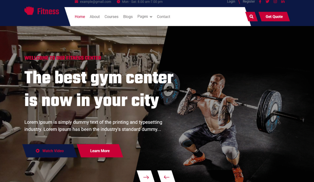
The header section exemplifies sophisticated multi-level navigation design that balances comprehensive information access with clean visual presentation. The top bar displays essential contact information including email addresses and operating hours, immediately communicating availability and accessibility to potential clients. Social media integration in the header provides direct links to the gym’s Facebook, Twitter, Instagram, and LinkedIn profiles, facilitating community building and social proof.
The dual-logo approach accommodates both desktop and mobile viewing experiences, with the primary logo prominently displayed on larger screens and a secondary mobile-optimized version appearing on smaller devices. This attention to responsive design details ensures brand consistency across all platforms. The navigation menu features a logical hierarchy with dropdown functionality for the Pages section, allowing extensive content organization without overwhelming the primary navigation bar.
The search modal implementation demonstrates thoughtful user experience design, providing full-screen search functionality that focuses user attention on finding specific content without distraction. The “Get Quote” call-to-action button receives prominent placement with distinctive styling, encouraging visitor conversion at every stage of their browsing experience. This strategic positioning of conversion elements throughout the navigation reflects best practices in fitness website design, where capturing lead information remains paramount.
Hero Section and Visual Impact
The carousel-based hero section creates immediate visual impact through large-format imagery and compelling messaging. This rotating banner approach allows fitness centers to showcase multiple aspects of their facility, from state-of-the-art equipment to group fitness classes and personal training sessions. Each carousel slide combines powerful headlines with supporting descriptive text and dual call-to-action buttons, providing multiple pathways for visitor engagement.
The typography hierarchy in the hero section uses display-level heading sizes to create dramatic emphasis, ensuring messages remain readable even on the compelling background imagery. The dark overlay technique applied to background images maintains text legibility while preserving the visual appeal of the photography. This balance between aesthetic design and functional communication represents a critical consideration in fitness website development, where emotional appeal must coexist with clear information delivery.
The inclusion of both “Watch Video” and “Learn More” buttons acknowledges different visitor preferences and stages in the decision-making process. Some potential members respond better to video content showcasing the facility atmosphere and energy, while others prefer reading detailed information about programs and pricing. Providing both options maximizes conversion opportunities by catering to diverse user behaviors and preferences.
About Section and Trust Building
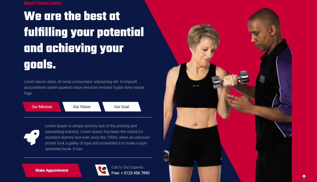
The about section employs a split-screen layout that combines textual information with supporting imagery, creating visual balance while delivering substantial content. The tabbed interface for Mission, Vision, and Goal allows extensive information presentation within a compact, organized structure. This approach respects visitor attention spans by revealing information progressively rather than overwhelming users with lengthy text blocks.
The prominent phone contact element with visual iconography and supporting text creates a direct conversion opportunity for visitors preferring immediate human interaction. This acknowledgment that not all potential members want to complete online forms reflects sophisticated understanding of customer journey mapping. The facility image showcasing equipment and space provides visual evidence supporting the textual claims about quality and capability.
The strategic use of white space and typography hierarchy throughout the about section ensures comfortable reading experiences while maintaining visual interest. The primary color accents draw attention to key information points and calls-to-action without creating visual chaos. This restrained approach to color application demonstrates professional design sensibility appropriate for fitness brands seeking to convey competence and reliability.
Fitness Goal Section and Value Proposition
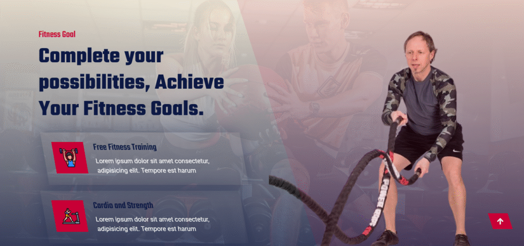
The fitness goal section articulates the facility’s unique value proposition through a combination of headline messaging and specific feature highlights. The icon-based feature presentations create scannable content that communicates benefits quickly, acknowledging that many website visitors skim rather than read extensively. Each feature block combines visual iconography, descriptive headlines, and supporting text to create comprehensive yet digestible information units.
The asymmetrical layout balancing textual content with a large supporting image creates visual dynamism while maintaining professional presentation standards. This design approach prevents the monotony that can result from overly symmetrical layouts while ensuring content remains organized and accessible. The prominent “Read Details” call-to-action encourages deeper engagement from interested visitors while allowing casual browsers to continue exploring other sections.
The background styling and spacing create clear section delineation, helping visitors understand the content structure and navigate the page intuitively. This attention to visual hierarchy and section separation reflects understanding of how users actually interact with websites, often scrolling rapidly and pausing only when something captures their interest. The goal section design accommodates this behavior while encouraging meaningful engagement.
Features Showcase and Differentiation
The features carousel presents the fitness center’s distinguishing characteristics through visually appealing card-based layouts. Each feature card combines photography, descriptive headlines, supporting text, and individual call-to-action buttons, creating self-contained information units that work both independently and as part of the broader narrative. The carousel format allows showcasing numerous features without creating overwhelming vertical scrolling, particularly beneficial for mobile users.
The consistent card structure across all feature presentations creates visual rhythm and predictability that enhances user experience. Visitors quickly understand the information pattern and can efficiently evaluate multiple features. The hover effects and animation timing create interactive feedback that makes the interface feel responsive and alive, contributing to the overall impression of modernity and professionalism.
The strategic photography selection for each feature card communicates specific aspects of the fitness experience, from high-energy group classes to focused individual training sessions. These images serve dual purposes, both illustrating the described features and creating emotional connections with potential members who see themselves in the depicted scenarios. This psychological dimension of website design significantly influences conversion rates and should not be underestimated.
Course Listings and Program Information
The courses section represents one of the most critical components for fitness websites, as class schedules and program offerings directly influence membership decisions. The grid-based layout presents multiple courses simultaneously while maintaining individual course clarity through card-based organization. Each course card delivers comprehensive information including instructor names, scheduling details, and program descriptions within a compact, scannable format.
The trainer thumbnails and names create personal connections between potential members and facility staff, humanizing the gym experience and building trust. The specific date and time information demonstrates organizational professionalism while enabling visitors to immediately assess schedule compatibility with their availability. This detailed information delivery reduces friction in the decision-making process by answering common questions before they arise.
The iconography distinguishing different course types provides visual shorthand that enables rapid course identification and comparison. This visual categorization system works particularly well for visitors familiar with fitness terminology who can quickly identify programs matching their interests and goals. The consistent styling and spacing across all course cards creates professional presentation that reflects positively on the facility’s overall quality and attention to detail.
Blog Integration and Content Marketing
The blog section acknowledges the critical role of content marketing in modern fitness business strategy. Regular blog posts establish the fitness center as a knowledgeable authority, improve search engine visibility, and provide shareable content for social media platforms. The carousel presentation format showcases multiple recent articles while conserving vertical space, encouraging visitors to explore the content library without overwhelming the homepage.
Each blog post preview includes author attribution, publication dates, featured imagery, headline, excerpt, and a clear call-to-action for full article access. This comprehensive preview structure enables visitors to assess content relevance before clicking through, reducing bounce rates and improving overall engagement metrics. The consistent formatting across all blog previews creates professional presentation and makes the content library appear substantial and well-maintained.
The strategic placement of the blog section relatively late in the page structure ensures visitors first encounter core information about facilities, programs, and pricing before reaching educational content. This sequencing reflects understanding of typical visitor priorities and conversion funnels, where establishing credibility and showcasing offerings precedes building authority through thought leadership content.
Team Profiles and Personal Connection
The team section addresses the fundamental truth that fitness success depends heavily on trainer-client relationships. By showcasing individual trainers with professional photography and social media links, the website facilitates personal connections before potential members ever visit the facility. This transparency builds trust and helps visitors envision themselves working with specific trainers whose specialties align with their goals.
The grid layout presents multiple team members simultaneously, communicating the depth of expertise available at the facility. The social media integration for each trainer enables interested visitors to research individual backgrounds, philosophies, and specialties before committing to membership. This self-service research capability appeals to modern consumers who prefer gathering information independently before engaging in sales conversations.
The professional photography quality throughout the team section reinforces brand positioning and communicates the facility’s commitment to excellence. Inconsistent or amateur photography in this section would undermine trust and suggest lack of attention to detail. The investment in professional team photography represents money well spent, as these images directly influence membership conversion rates.
Video Integration and Virtual Tours
The “Explore Fitness Center” section with video integration represents recognition that virtual facility tours have become essential in modern fitness marketing. Potential members want to see equipment quality, facility cleanliness, space layout, and atmosphere before visiting in person. Video content delivers this information efficiently while creating emotional engagement through dynamic presentation.
The prominent placement and dramatic styling of the video section create compelling invitation to deeper engagement. The play button iconography provides clear affordance, immediately communicating interactivity. The full-width presentation ensures the video content receives appropriate emphasis, acknowledging its importance in the conversion process. This section positioning late in the page ensures visitors have already received substantial information before encountering the video, meaning those who click through demonstrate significant interest.
The dark background and contrasting text create visual drama that captures attention during scrolling. This bold design choice reflects confidence in the video content quality and understanding that well-produced facility tours significantly influence membership decisions. The relatively minimal text in this section wisely allows the video content to speak for itself rather than competing for attention.
Responsive Design Implementation
The template’s responsive design implementation ensures consistent functionality and aesthetic appeal across all device types and screen sizes. The Bootstrap grid system automatically adjusts layouts from multi-column desktop presentations to single-column mobile views, maintaining content hierarchy and accessibility regardless of viewport dimensions. This responsive approach has moved from competitive advantage to absolute necessity, as mobile traffic now represents the majority of web browsing for most industries.
The navigation transforms from horizontal menu bar to collapsible hamburger menu on smaller screens, preserving screen real estate while maintaining complete feature access. The touch-friendly button sizing and spacing throughout the mobile experience acknowledges different interaction paradigms between mouse-based desktop browsing and touch-based mobile usage. These seemingly small details significantly impact user experience and conversion rates on mobile devices.
The image optimization and lazy loading implementation ensures fast page loads even on slower mobile connections, reducing bounce rates caused by long loading times. The progressive disclosure of content through carousels and collapsible sections prevents overwhelming mobile users with extensive vertical scrolling while maintaining information completeness. This balance between comprehensive content and mobile usability represents sophisticated responsive design thinking.
Performance Optimization Strategies
The template structure incorporates several performance optimization strategies essential for modern web experiences. The external stylesheet and script organization enables browser caching, reducing load times for returning visitors. The CSS and JavaScript minification reduces file sizes, accelerating initial page loads. The strategic script placement at document end prevents render-blocking, ensuring visible content appears quickly even before full JavaScript functionality loads.
The image format selection and sizing throughout the template balances visual quality with file size considerations. The lazy loading implementation for below-the-fold images prevents unnecessary data transfer for content visitors may never see, particularly important for mobile users on limited data plans. These technical optimizations directly impact both user experience and search engine rankings, as Google increasingly prioritizes page speed in search algorithms.
The modular code organization facilitates future maintenance and updates, reducing long-term ownership costs for fitness center operators. The clear HTML structure with semantic elements improves accessibility for users with disabilities while providing search engines with clear content understanding. These often-overlooked technical considerations significantly impact website effectiveness over time.
Customization and Brand Adaptation
While the template provides comprehensive starting structure, successful implementation requires thoughtful customization to reflect specific brand identity and market positioning. The color scheme should align with existing brand guidelines, creating visual consistency across all marketing materials. The typography choices should reinforce brand personality, whether that’s serious and performance-focused or welcoming and community-oriented.
The imagery throughout the template must be replaced with authentic facility photography rather than stock images. Potential members can detect stock photography and may question facility quality if the website relies on generic imagery. Professional photography showcasing actual equipment, trainers, and members creates authenticity that significantly improves conversion rates. This photography investment represents one of the most impactful customizations possible.
The textual content requires complete rewriting to reflect specific programs, pricing, philosophies, and unique value propositions. The placeholder text provides structural guidance but cannot effectively communicate what makes any particular fitness center special. This content development process should involve key stakeholders who understand both the business and target audience, ensuring messaging resonates with ideal prospective members.
Conclusion and Implementation Considerations
This comprehensive fitness club website template provides an excellent foundation for establishing professional digital presence in the competitive fitness industry. The combination of modern design principles, responsive implementation, and fitness-specific features addresses the unique needs of gym operators seeking to attract and convert online visitors into paying members. The template’s modular structure allows adaptation to various fitness business models, from boutique studios to full-service athletic clubs.
Successful implementation requires investment in quality content development, professional photography, and thoughtful brand adaptation beyond simply installing the template code. The technical foundation provided by this template eliminates substantial development time and cost, but the customization work determines ultimate effectiveness. Fitness center operators should view this template as a starting point requiring strategic adaptation rather than a complete turnkey solution.
The ongoing maintenance requirements for fitness websites include regular content updates, class schedule adjustments, trainer profile maintenance, and blog post publication. These ongoing efforts maintain search engine visibility and demonstrate active business operation to potential members. The template structure facilitates these updates through clear code organization and standard content management approaches, reducing long-term operational burden while maximizing digital marketing effectiveness.

Download Fitness Club Website HTML Template Source Code
